Brand Identity / Naming / Typography / Brand Experience
Contribution: Concept / Logo Design / Video / Photography / Competitive Analysis / Prototyping
Contribution: Concept / Logo Design / Video / Photography / Competitive Analysis / Prototyping
Byron and Leach is a footwear brand and product design proposal for an entrepreneur who aimed to launch a high-end sneaker brand.
The client approached a group of graphic designers with a clear idea of developing a luxury footwear brand and a sneaker design that could be used, both, at the office and at an exclusive NYC nightclub. However, there was a lack of target audience, brand strategy, product, concept and identity.
Click here to see the footwear design process.
Targeting the modern dandy
With the rise of luxury sneakers and its evolution from casual footwear to dress shoes, the target audience was defined as men on their late 20's and early 30's who are interested in fashion, take care of their appearance, look to be the best version of themselves, and want to show their uniqueness.
Understanding the landscape
To define a clear competitive landscape among the variety of sneaker brands in the market, a selection of emergent (in 2014) luxury sneaker brands —with similar quality, price, and target audience to the ones Byron&Leach seeks to achieve— was chosen as direct competitors.
The brands were analyzed on a 2x2 matrix by comparing two core drivers of the brand: premium quality and traditional craftsmanship. The analysis was based on customers' perception and secondary research. A deeper analysis of the brands located on the upper right corner was conducted. This included values, philosophy, materials, product lines, strengths and weaknesses.
Finding a unique voice
In order to connect with the target audience a brand personality and a set of brand attributes were defined:
+ Sophistication
+ Audacity
+ Duality
+ Candidness
Brand personality
The brand personality was based on the common archetypes theory developed by the psychologist Carl Gustav Jung, which presents 12 fundamental human motifs that reside within the collective unconscious of people.
Two main archetypes were determined, as they share similarities with the target audience:
The Rebel: "Rules are made to be broken"
The Ruler: "Power isn't everything, it's the only thing".
Brand purpose
— "A brand that redefines the gentleman style"
Leather jackets and tuxedos
Following the brand attributes, personality, and aim of developing a sneaker design with a dual use, four concepts were proposed, and the concept "Classic Rebels" was selected.
The rebellious style from the 50s —leather jackets and motorcycles— and the elegance of from the 60s —tuxedos and ties— are the essence of the concept that drives the development of the brand identity.
The men behind the name
The name "Byron & Leach" comes from the unknown surnames of two movie stars that represent the rebel and classic styles of the brand.
Byron is the middle name of the American rebel actor James Byron Dean, and Leach is the surname of the British sophisticated actor Archibald Alexander Leach, better known as Cary Grant.
Looking like a million dollars
The visual identity for Byron&Leach follows the visual approach of the most known and luxurious brands in the market to create a timeless and lasting brand that feels familiar to the audience.
Custom-made everything
Three custom-made typographic marks were developed or the brand: The primary logotype features a modern Serif typeface that conveys sophistication and elegance, as well as a masculine look and feel due its bold weight.
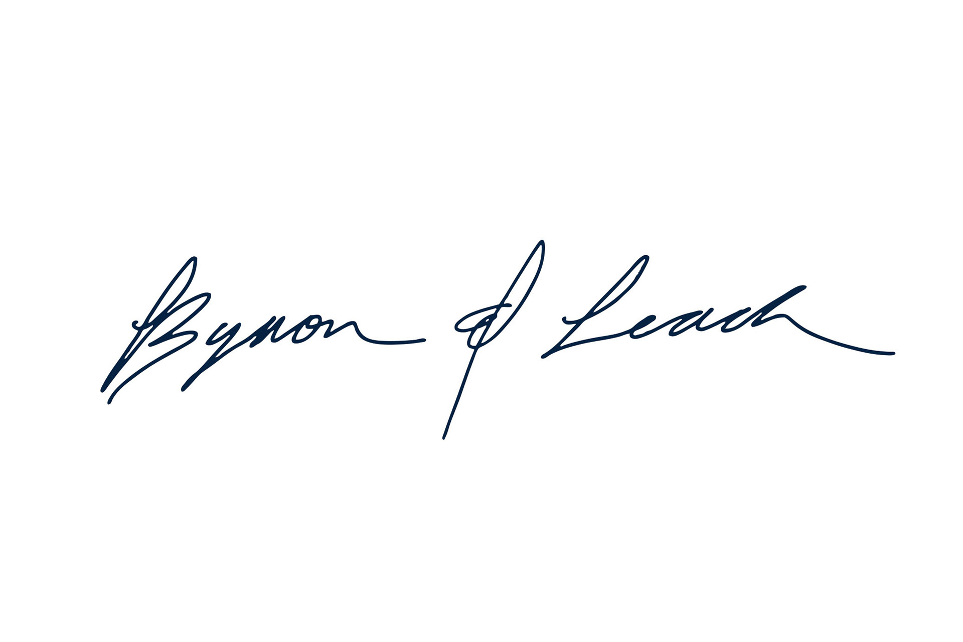
The secondary mark, a hand made signature, was designed for applications that imply a closer interaction with the client with the aim of creating a customized person-to-person experience.
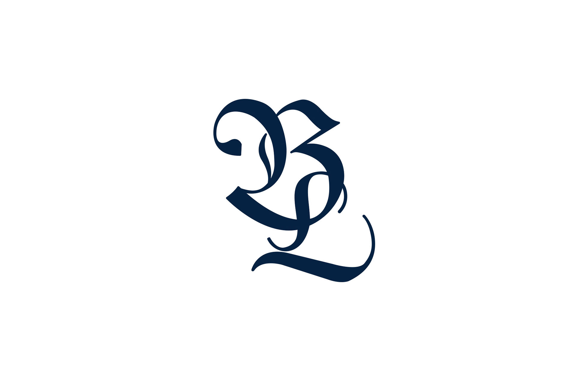
The monogram, designed with Gothic features, contrasts the elegance of the primary logotype and functions as the certificate of authenticity seal for the products.
Similar to high-end fashion brands, the visual identity for Byron&Leach owns to colors, a deep dark blue that represents power and confidence, and silver as a complementary color for luxury.
Closing the rose loop
To complement the jewelry piece of footwear, which is the differentiator of the brand, a texture of a rose tree was designed that with the delicacy of the flowers and the roughness of its thorns, represents the duality of the brand. This texture is applied as an embossed finish on printed materials like bags, shoebox, and stationary.
A shopping and shipping experience
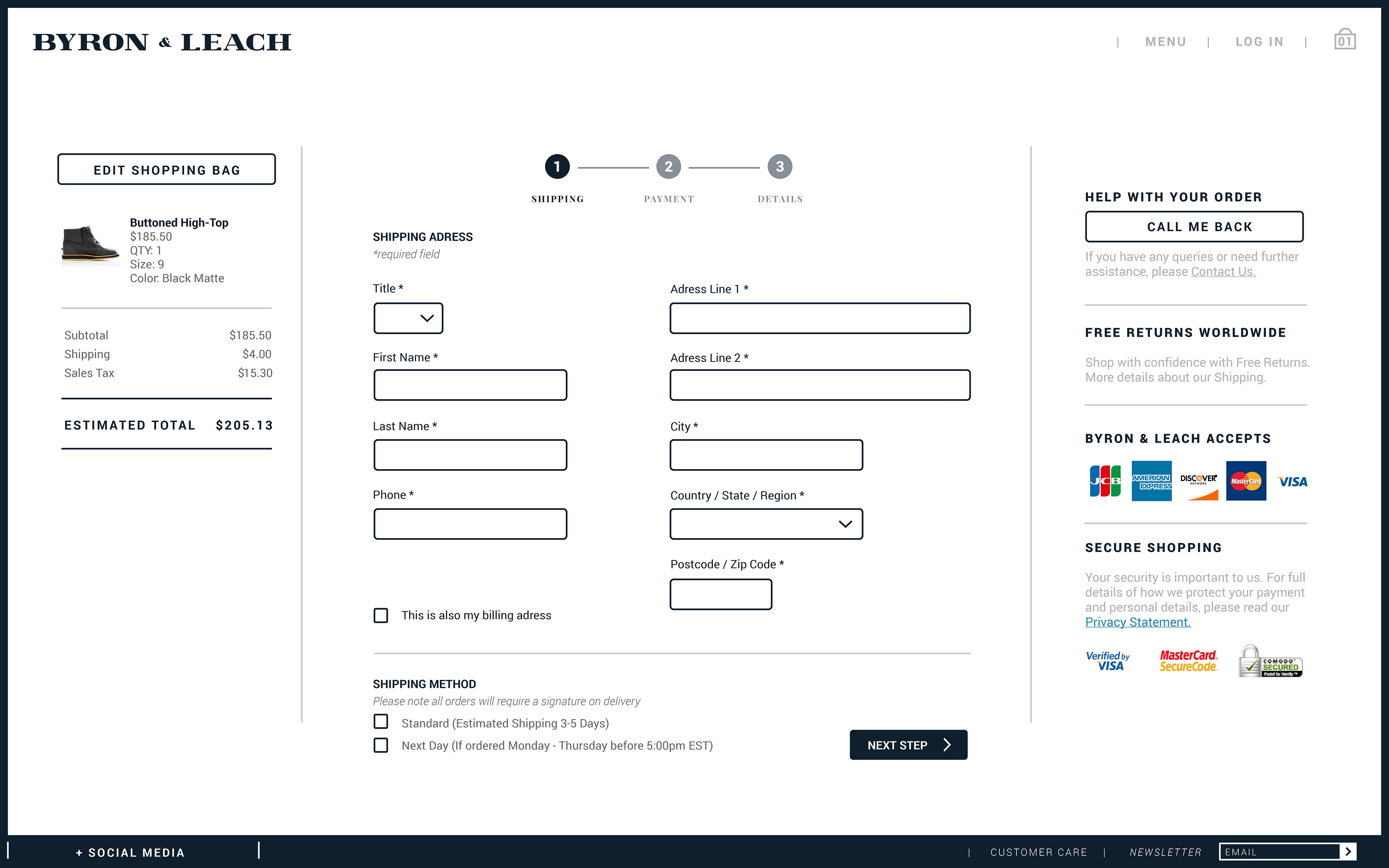
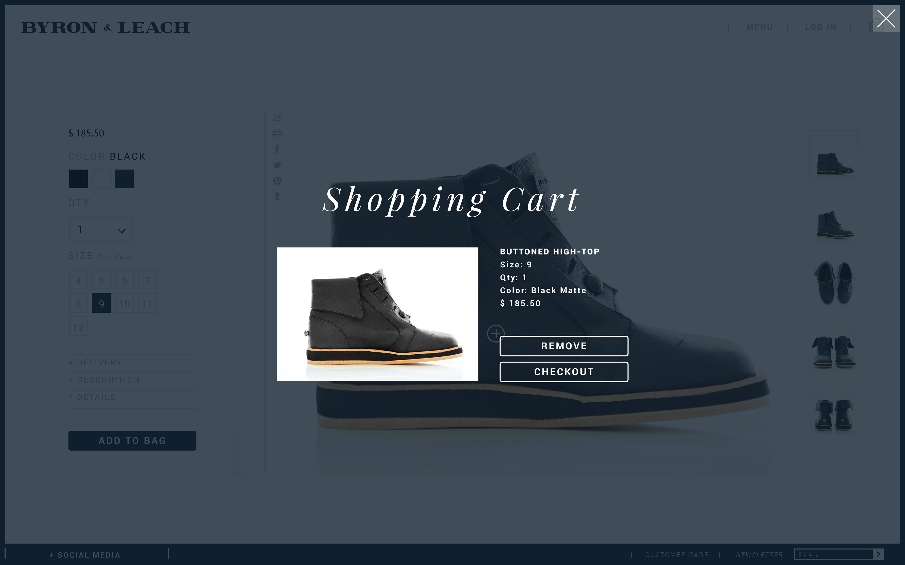
Because new generations prefer online shopping, all materials for the brand were designed for an online shopping experience, starting from an online store and ending with a premium unboxing experience that features customized messages, a shoebox, and receipts sheets inside embossed envelopes.
